Bianca, a restaurant management dashboard

48 managers and 572 employees reported the exact same problem. No one had solved it.

The Bianca restaurant management dashboard
Platform
restaurant management app
Role
UX/UI · Branding
Timeline
6 weeks
Tools
Figma

Two weeks. Two sides of the same system.

To understand why running a restaurant feels so chaotic, I ran a research sprint: I surveyed managers and employees separately, then cross-referenced their frustrations. The scale of the problem came through immediately.

48Quantitative survey sent to restaurant managers
3In-depth interviews conducted with managers
572Separate quantitative survey across restaurant employees
The key insight

The information was already there. What the research found was cognitive load: in existing interfaces, urgent and trivial blend together.

The problem

The same pain, experienced from opposite directions

Managers:
  • Hard to see who's working when
  • High employee turnover creates constant last-minute changes (sickness, sudden unavailability, people quitting, exams), and each one demands immediate clarity that isn't there
  • No overall picture of the week, because everything runs in duplicate, split between a shared WhatsApp group and separate personal messages
Employees:
  • Unclear when I'm working
  • Changes arrive last-minute
  • No overall picture of the week
Solution · Dashboard

A dashboard built for decisions, not just data display

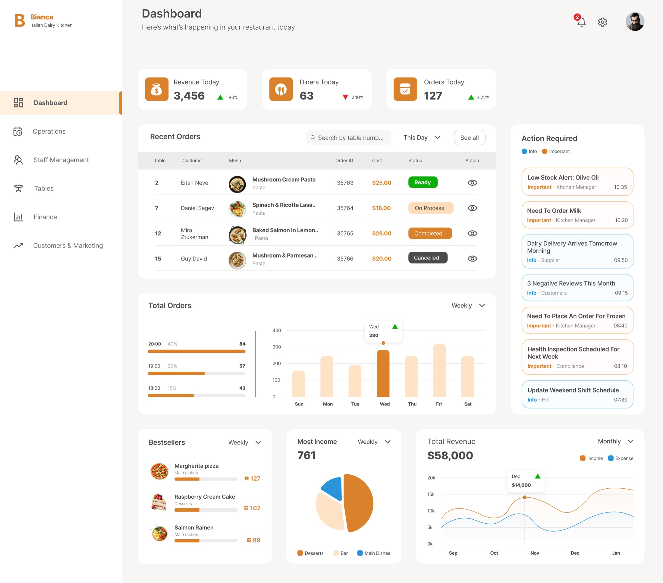
I chose a central dashboard over separate reports because the research showed managers need to decide fast in the morning rather than analyze deeply. The dashboard is built around action: what needs attention right now.

The Bianca dashboard: the restaurant's whole day at a glance

Separating critical from important. To reduce the cognitive load the research identified, I clearly separated Critical Alerts, shown first at the top, from Important and Informational Alerts shown below. Urgent things look urgent, and routine things don't compete with them.

Solution · Operations

Menu, inventory and ordering in one place

Previously, managers had to jump between three disconnected sections to manage the daily flow of ingredients and supplies. I unified Menu management, Inventory, and Purchases into a single operational category, so a manager can move from "what do we have" to "what do we need to order" in one place, without context-switching.

Solution · Staff management

Built for high turnover

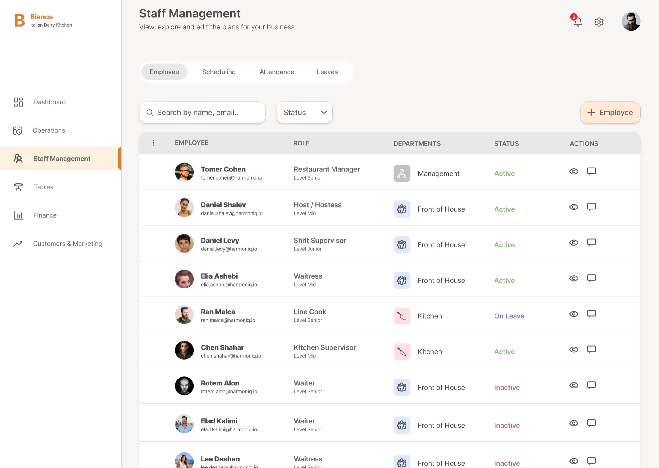
High employee turnover is one of the most consistent pain points managers reported. I built a dedicated Staff section with full transparency: who's active, who isn't, and how to quickly find and edit any record. An add-employee flow keeps onboarding fast even when someone joins mid-week.

Bianca staff management: the employee directory with active, on-leave and inactive states

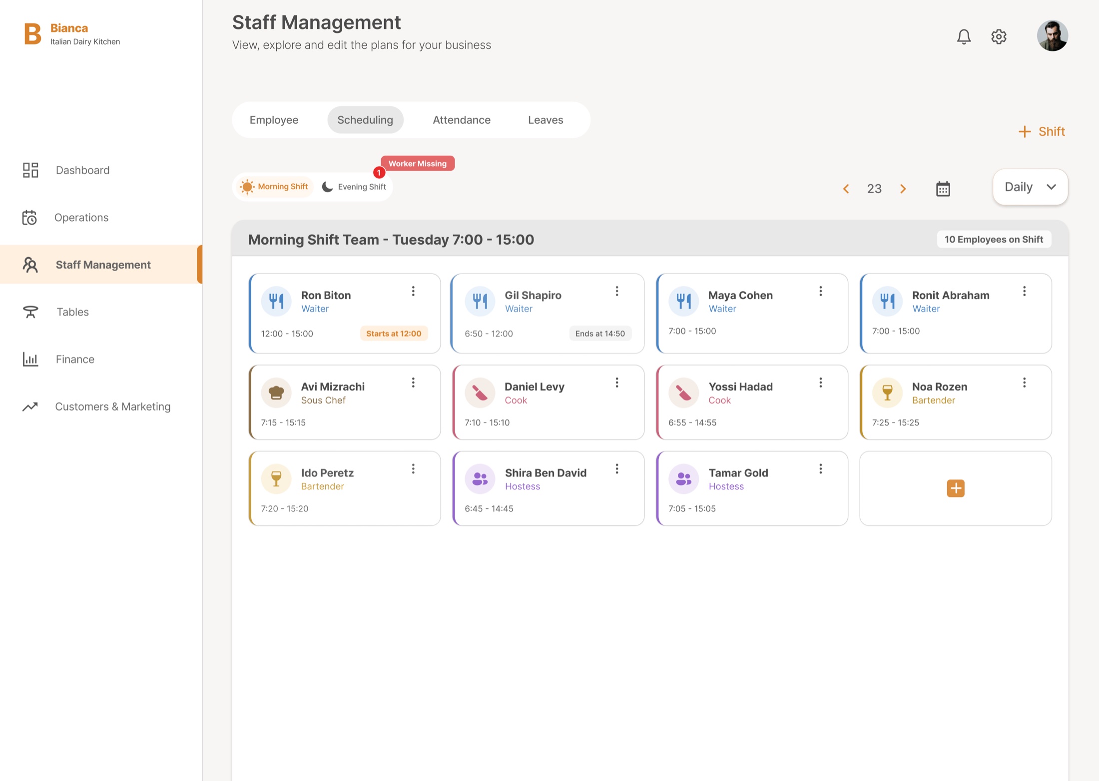
Scheduling was the other half of the shared problem. Both managers and employees reported not having a clear picture of the week. The weekly shift board shows the manager the whole week at a glance, and shows the employee exactly when they're working, instead of leaving that information scattered between a WhatsApp group and personal messages. If a shift is understaffed, the system flags it in red, so the manager doesn't discover the problem at the last minute. If an employee ends a shift early, the system automatically bumps them to the top of the list, in gray, with their available hours marked, so re-staffing happens immediately, without manually searching for who's free.

Bianca staff management: the weekly scheduling board with understaffed shifts flagged in red
Impact

A manager opens Bianca in the morning and sees exactly what to do next.

The urgency levels are separated, operations sit in one category, and the whole week is on a single board. That turns a noisy dashboard into one a manager can act on without switching tabs or hunting through menus to find out who's free.

Liked this project?
Let's talk.

Back to all work